flex 布局练习 demo
01. 垂直居中
<div id="container">
  <div id="item"></div>
</div>
#container {
  display: flex;
  width: 300px;
  height: 300px;
  outline: solid 1px;
  justify-content: center;
  align-content: center;
  align-items: center;
  background-color: aqua;
}
#item {
  width: 100px;
  height: 100px;
  outline: solid 1px;
  background-color: red;
}
效果:

02. 两列等高
<div class="container">
  <div class="item" style="height: 300px; background-color: red"></div>
  <div class="item"></div>
</div>
<br />
<div class="container">
  <div class="item"></div>
  <div class="item" style="height: 300px; background-color: yellow"></div>
</div>
.container {
  display: flex;
  width: 300px;
  justify-content: center;
  align-content: center;
  align-items: stretch;
  background-color: blue;
}
.item {
  width: 100px;
  outline: solid 1px;
  background-color: green;
}
效果:

03. 自适应宽度
.parent {
  display: flex;
  width: 500px;
  height: 200px;
}
.child1 {
  width: 100px;
  flex: 2;
  background-color: lightblue;
}
.child2 {
  width: 100px;
  flex: 1;
  background-color: yellow;
}
<body>
  <div class="parent">
    <div class="child1"></div>
    <div class="child2"></div>
  </div>
</body>
效果:

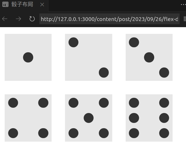
04. 骰子布局
face 代表表面, pip 代表点数
效果:
-
一点
<div class="first-face"> <span class="pip"></span> </div>.first-face { display: flex; justify-content: center; align-items: center; }justify-content: center容器内项目横向居中align-items: center容器内项目纵向居中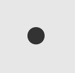
-
两点
<div class="second-face"> <span class="pip"></span> <span class="pip"></span> </div>.second-face { display: flex; justify-content: space-between; } .second-face .pip:nth-of-type(2) { align-self: flex-end; }justify-content: space-between横向主轴上的两个元素, 首尾贴合容器边缘.pip:nth-of-type(2)第二个 pip 元素align-self: flex-end与交叉轴的终点对齐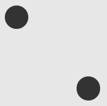
-
三点
<div class="third-face"> <span class="pip"></span> <span class="pip"></span> <span class="pip"></span> </div>.third-face { display: flex; justify-content: space-between; } .third-face .pip:nth-of-type(2) { align-self: center; } .third-face .pip:nth-of-type(3) { align-self: flex-end; }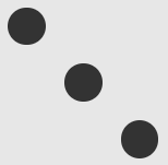
-
四点
<div class="fourth-face"> <div class="column"> <span class="pip"></span> <span class="pip"></span> </div> <div class="column"> <span class="pip"></span> <span class="pip"></span> </div> </div>.fourth-face { display: flex; justify-content: space-between; } .fourth-face .column { display: flex; flex-direction: column; justify-content: space-between; }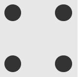
-
五点
<div class="fifth-face"> <div class="column"> <span class="pip"></span> <span class="pip"></span> </div> <div class="column"> <span class="pip"></span> </div> <div class="column"> <span class="pip"></span> <span class="pip"></span> </div> </div>.fifth-face { display: flex; justify-content: space-between; } .fifth-face .column { display: flex; flex-direction: column; justify-content: space-between; } .fifth-face .column:nth-of-type(2) { justify-content: center; }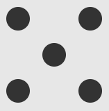
-
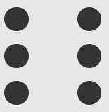
六点
<div class="sixth-face"> <div class="column"> <span class="pip"></span> <span class="pip"></span> <span class="pip"></span> </div> <div class="column"> <span class="pip"></span> <span class="pip"></span> <span class="pip"></span> </div> </div>.sixth-face { display: flex; justify-content: space-between; } .sixth-face .column { display: flex; flex-direction: column; justify-content: space-between; }